Friday, April 23, 2010

Standardized Choropleth Map

This type of map is pretty simple and mostly use percentages or ratios to prove a point. The following map show the percentage of people who are Hispanic in the State of Florida. The darker color shows a higher rate than the lighter color.

http://my.ilstu.edu/~jrcarter/Geo204/Choro/Tom/hispanic_race_fl-H1_FINAL.gif

http://my.ilstu.edu/~jrcarter/Geo204/Choro/Tom/

Index Value Plot

This type of tool is sometimes used to measure the increase or decrease of stocks and the stock market. It is usually used to plot some type of investment.


http://envstudies.brown.edu/oldsite/Web/special%20reports/Classes/ES201/2000/Drought%20Management/D%20-%20Indicators/indices%20with%20data/PDI/PDI%20Index%20Value.png

http://envstudies.brown.edu/oldsite/Web/special%20reports/Classes/ES201/2000/Drought%20Management/D%20-%20Indicators/indices%20with%20data/PDI/index%20value%20graph.html

Nominal Area Choropleth

A Nominal Area Choropleth shows nominal data on a map. The following is a map that shows the water use for the United States in 2000.

http://ga.water.usgs.gov/edu/graphics/wateruse2000choropleth.gif

http://ga.water.usgs.gov/edu/wateruse2000.html

Univariate Choropleth Map

This type of map only demonstrates one variable throughout the map.
http://rosuda.org/~theus/Blog/Choro.jpg


http://statgraphics.blog.com/page/2/

Bivariate Choropleth Map

This type of map show two variables by combining different colors. These types of maps have proven extremely hard to understand.

http://revolution-computing.typepad.com/.a/6a010534b1db25970b0120a6879759970b-500wi

http://blog.revolution-computing.com/2009/11/choropleth-map-r-challenge.html

Accumulative Line Graph

The accumulative line graph, also called ogive, is used in statistics when a person wants to knwo a total at any time. By combining the variables that are given the user can find out the total throughout the process. Here is an accumulative line graph of Lake Waco in 1990-1994.

http://www.tx.nrcs.usda.gov/technical/wrat/images/swat/weblinec.gif
http://www.tx.nrcs.usda.gov/technical/wrat/swat_output.html

Bilateral Graph

This is another way to distinguish between two variables. The following maps shows how much humanitarian aid and other financial aid has been given to a country.

http://www.dfid.gov.uk/Images/sid2009/figure%204.jpg

http://www.dfid.gov.uk/About-DFID/Finance-and-performance/Aid-Statistics/Statistics-on-International-Development-2009/Section-3---How-much-is-UK-expenditure-on-International-Development/

Thursday, April 22, 2010

Population Profile

A population profile show a number of people in the population by their ages. Here is a chart of the immigrants to the United States in 2004.

http://www.populationaction.org/Publications/Reports/The_Shape_of_Things_to_Come/asset_upload_file420_6098.gif

http://www.populationaction.org/Publications/Reports/The_Shape_of_Things_to_Come/Chapter_Six_Subtypes_and_a_Speculative_Structure.shtml

Scatterplot

This is another way of showing the correlation between data by use many scattered points along a trend line. It is an exercise that can be seen in any type of math or statistics. Here is a map that shows how fast a car can go by weight and gallons.

http://www.statmethods.net/graphs/images/scatterplot1.jpg
http://www.statmethods.net/graphs/scatterplot.html

Windrose

A Windrose is a graphic pattern that measure the wind speed and direction. The pattern is broken down into many different colors that represent the speed. This is a tool that meteorologists use in their everyday work.

http://www.maine.gov/dep/air/meteorology/windroses/Images/owlshead%202002%20to%202006%20windrose.gif

http://www.maine.gov/dep/air/meteorology/Windrosehome.html

Triangular Plot

A Triangular Plot portrays the ratios of three variables that sum up to a constant. It goes by many names other than Triangular plot and is used for Mineralogy, Petrology, Etc.

http://www.pmel.noaa.gov/maillists/tmap/ferret_users/fu_2007/jpgCqrZqdDwYG.jpg

http://www.pmel.noaa.gov/maillists/tmap/ferret_users/fu_2007/msg00384.html

Parallel Coordinate Graph

On Parallel Coordinate Graph each point of data is mapped vertically which is then connected by a set of two data points. This is a map that was pulled from York University.

http://www.math.yorku.ca/SCS/Gallery/images/parallel-coords.gif

http://www.math.yorku.ca/SCS/Gallery/milestone/sec9.html

Box Plot

This is also a certain form of math that is used in Statistics. There are five different summaries that are used when using the box plot: the smallest observation, sample minimum, lower quartile, upper quartile, and sample maximum. Anything outside of these boxes is called an outlier and that is most likely thrown out.


http://www.itl.nist.gov/div898/handbook/eda/gif/boxplot0.gif

http://www.itl.nist.gov/div898/handbook/eda/section3/boxplot.htm

Correlation Matrix

This is frequently used in Statistics and it shows the correlation between two pairs of data.

https://particle.phys.uvic.ca/twiki/pub/AtlasUVic/ClusterStudies/CorrelationMatrixS.gif

https://particle.phys.uvic.ca/twiki/bin/view/AtlasUVic/ClusterStudies

Unclassed Choropleth Maps

This type of map does not individually classify information, hence the reason for the shades changes gradually.


http://www.princeton.edu/~rvdb/JAVA/election2004/purple_america_2004


http://www.princeton.edu/~rvdb/JAVA/election2004/purple_america_2004

Classed Choropleth Map

A Classed Choropleth Map has certain colors to classify data for certain areas. One example of this is the election maps.
http://uspresidentialelections.webs.com/Presidential%20Elections/1920-election.PNG

http://uspresidentialelections.webs.com/19201960.htm

DOQQ

Digital Orthophoto Quarter Quadrangles are raster images of Ariel photos. These photos are produced by taking ariel shots and then rectifying them. They can be taken in black and white as well as natural and near- infrared photos.

https://www.e-education.psu.edu/files/geog482/image/doq_bushkill_sw.jpg

https://www.e-education.psu.edu/natureofgeoinfo/c6_p17.html
According to the USGS Website "The U.S. Geological Survey's (USGS) digital line graph (DLG) files are digital vector representations of cartographic information. Data files of topographic and planimetric map features are derived from either aerial photographs or from cartographic source materials using manual and automated digitizing methods." The following map is from downtown Savannah, GA.


http://ga.water.usgs.gov/olympics/sav.sm.dlg.gif
http://ga.water.usgs.gov/olympics/sav.sm.dlg.html

DRG

Digital Raster Graphic happens when paper USGS topographic map is scanned into the computer.

http://egsc.usgs.gov/isb/pubs/factsheets/fs08801.graphics/drg.jpg

http://egsc.usgs.gov/isb/pubs/factsheets/fs08801.html

Isopleth Map

Isopleth Maps portray various data. For Example, it measures precipitation, surface elevations, and atmospheric pressures.

http://www.nature.nps.gov/air/edu/lessons/images/labh1996.gif
http://www.nature.nps.gov/air/edu/lessons/figure3.cfm

Isopach Map

The Isopach Map shows the variation in thickness over a land mass.


http://www.republicenergy.com/Articles/Barnett_Shale/Isopach_Barnett_Shale.jpg

http://www.republicenergy.com/Articles/Barnett_Shale/Barnett.aspx

Isohyet Map

On this map where to lines intersect, the data for rainfall will be measured.

http://www.artsci.wustl.edu/~anthro/courses/306/precip.GIF

http://artsci.wustl.edu/~anthro/courses/306/geography.html

Isotach Map

An Isotach Map is similar to the Isoline Map. When points connect on this particular map, it jusges wind speed.

http://www.atmos.washington.edu/~mcmurdie/oct96/isotach_height_300.gif

http://www.atmos.washington.edu/~mcmurdie/oct96/oct96_labs.html

LIDAR

The following can be done with LIDAR, a light remote sensing tool,
  • Measure distance
  • Measure speed
  • Measure rotation
  • Measure chemical composition and concentration


http://www.icrest.missouri.edu/Sensors/lidar.htm

Doppler Radar

Doppler Radar uses microwave waves that are bounced through the atmosphere to record data. This is commonly used in meteorology, etc.

http://www.weatherusa.net/blog/images/doppler-orlando-1943.gif

http://www.weatherusa.net/blog/index.php?month=August_2004

Infrared Ariel Photo

Infrared Ariel Photos are used for various tasks. They can be used in environmental research, farming, etc.

http://www.kgs.ku.edu/Current/2002/aber/jpegs/fig16.jpg

www.kgs.ku.edu/Current/2002/aber/aber6.html

Cartographic Animations

This type of map is animated so that the user can see the global climate changes.
http://uwacadweb.uwyo.edu/JSHINKER/images/tmp2msm.gif

http://uwacadweb.uwyo.edu/JSHINKER/

Cartogram

A Cartogram is similar to a Thematic Map. The two different Cartograms show area and Distance. These sort of maps are usually distorted to give the user a better understanding of the data that is being portrayed.

http://www-personal.umich.edu/~mejn/election/2008/countycartredblue1024.png

http://www-personal.umich.edu/~mejn/election/2008/

Flow Map

A Flow Map basically shows the process that it takes to get from point 'a' to point 'b'.

http://i.ehow.com/images/a04/p8/le/construct-process-flow-map-200X200.jpg

http://www.ehow.com/how_5022382_construct-process-flow-map.html

Isoline Maps

An Isoline map that has lines that join at a certain value. These maps are similar to Isobars, Isopachs, and Isotherm maps. The following is a Isoline map of Antarctic mean free-air gravity anomaly of WDM94 Model.


www.scar.org/publications/reports/20/Rep20a.html

Proportional Circle Map

The Proportional Circle Map represents its data through ranges of circles. Larger circles obviously represent a higher number and smaller circles represent a lower number. The following map shows the population of Mexican-Americans in the United States. This map shows that California has the largest Mexican-American population.


http://www.neiu.edu/~jrthomas/377/circle.jpg

www.neiu.edu/~ejhowens/377/examples.htm

Dot Density Map

A Dot Density Map represents certain data through randomly paced dots. Commonly, this type of map will represent the population in an area.

statedotdensity.gif (16182 bytes)
http://hosting.soonet.ca/eliris/remotesensing/bl130lec7.html

PLSS Map

The following PLSS Map is from Frankin County, Alabama. This type of map is used in the United States to survey for and titles and deeds. It is also used to keep accurate track of the amount of land that has not been developed in the United States.


http://www.rootsweb.ancestry.com/~alfrankl/franklin6.jpg

www.rootsweb.ancestry.com/~alfrankl/land.html

Statistical Map


A Statistical map shows the variation in any data of the map maker's choosing. This map show the crime rate in Denver, Colorado.
http://www.denvergov.org/2001_crime_stats/Burglary/Burglary2/tabid/377611/Default.aspx

Wednesday, April 21, 2010

Climograph

A Climograph is used to represent the temperature and rainfall for a specific place.

http://geography.ridley.on.ca/CGC1D/Students/Quebec2/Geo./Climographs_files/image003.png
http://geography.ridley.on.ca/CGC1D/Students/Quebec2/Geo./Climographs.htm

Histogram

A histogram is used to represent data in the form of a bar chart. This map is used to represent the possible scores of students.

http://media.techtarget.com/digitalguide/images/Misc/iw_histogram.gif

http://searchsoftwarequality.techtarget.com/sDefinition/0,,sid92_gci330729,00.html

Unstandardized Chloropleth Map

Here is an unstandardized chloropleth map taken from the 2004 elections.


http://wpcontent.answers.com/wikipedia/commons/thumb/c/ca/2004US_election_map.svg/280px-2004US_election_map.svg.png
www.answers.com/topic/choropleth-map

Windrose

A Windrose demonstrates wind in the shape of a rose. This map was taken from the NOAA website.

http://www.crh.noaa.gov/images/sgf/climate/windrose/windrose_sgf_apr.png

www.crh.noaa.gov/sgf/?n=feb2008_climate_summary

Stem and Leaf Plot

This is used in many math/statistics classes to demonstrate the distribution of numbers. One example of this is the times table poster in many classrooms.

http://larawbar.com/data/library/knowledge/m.ehsan_mental_math/times-table-10x10.gif
http://larawbar.com/data/library/knowledge/m.ehsan_mental_math/m.ehsan_mental_math.htm

Propaganda Map

A Propaganda Map can be used to promote a country to make itself look better than it is or it can be used to do harm to a cause. This is a map of Germany that has been illustrated to make the country appear bigger than it is.

http://www.alternatehistory.com/Discussion/attachment.php?attachmentid=37709&stc=1&d=1194866851
http://www.alternatehistory.com/Discussion/showthread.php?t=76102

Topographic maps

This type of map show the different elevations of land by include curves. It makes the map more realistic to the view so that the landscape does not appear to be flat.

topo map

www.compassdude.com/topographic-maps.shtml

Hypsometric Map

A Hypsometric Map can show the different landscape by
shading in the different elevations of the land with certain colors.

http://www.co.kittitas.wa.us/images/maps/map_wa_relief.jpg
lu.com/odlis/odlis_h.cfm

DEM

A DEM or Digital Elevation Model represents the landscape by showing the different changes in the elevation of the land. This type of map is done by remote sensing technology.

http://www.unb.ca/passc/ImpactDatabase/images/Araguainha%20DEM.JPG
www.unb.ca/.../images/araguainha.htm

Similarity Matrix

The Similarity Matrix is a way to map the different points of data between two variables. It is very similar to mapping matrices in Calculus.

http://www.inf.ethz.ch/personal/cannaroz/courses/compbio/week2/g.gif
www.inf.ethz.ch/.../week2/week2/week2.html

Star Plot

The Star Plot is a way of storing mathematical data using a map. This map represents individual cars varying from the largest weight to the smallest weight.
http://www.math.yorku.ca/SCS/icons/sugi16/staraut2.gif
www.math.yorku.ca/SCS/sugi/sugi16-paper.html

Cadastral Map

The following map is a map that it used to record property data, boundaries, and so on. This map was taken from the Bay County, FL Property Appraisers Office.the map
http://qpublic6.qpublic.net/fl_bay_printit.html?extent=1588903.33984375+500183.4375+1602470.48828125+507714.9609375&llextent=-85.703982+30.369853+-85.660677+30.390948&layers=copyright+counties+cities+parcels+roads&parcel=undefined

Isobars

Isobars show the air pressure on a weather map. This is a typically shown during hurricane
season or when demonstrating cold fronts.
http://www.crh.noaa.gov/Image/unr/05-06-99/99050612_sfc.gif
www.crh.noaa.gov/unr/?n=05-06-99

Thematic Map

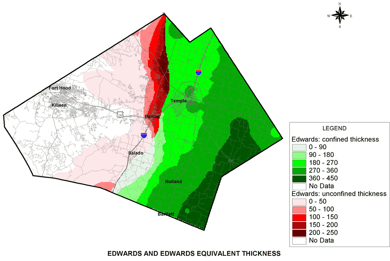
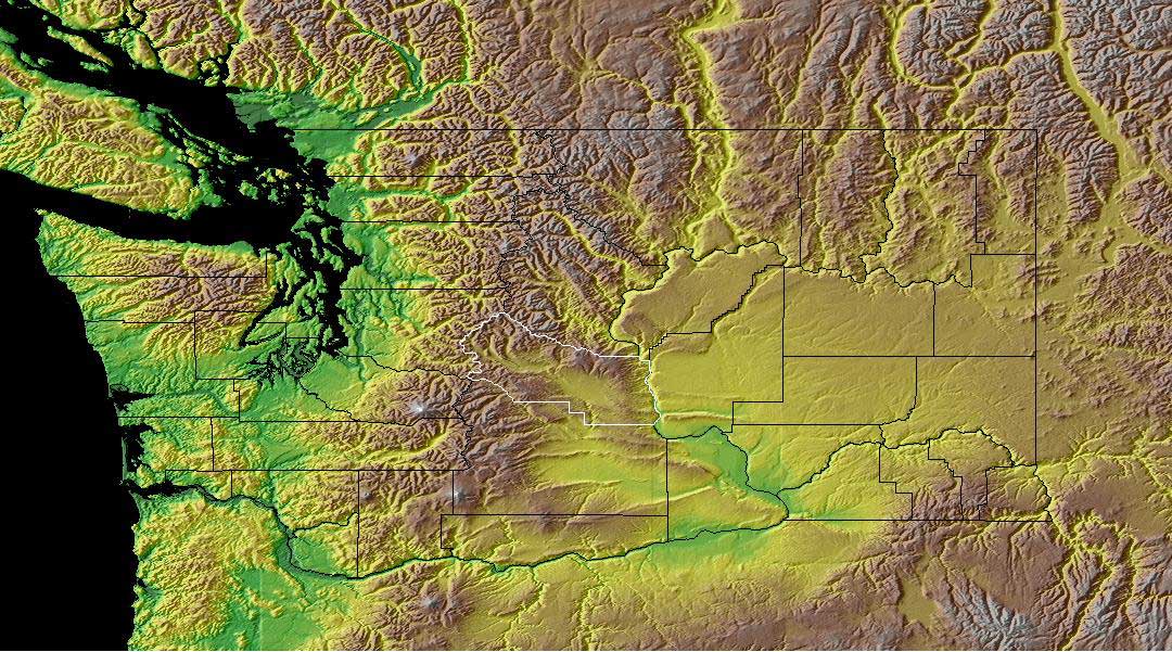
This map shows the water levels in an aquifer in Texas. These type of maps can show"physical, social, political, cultural, economic, sociological, agricultural, or any other aspects of a city, state, region,nation , or continent".

http://proceedings.esri.com/library/userconf/proc02/pap0710/p07104_LG.gif

proceedings.esri.com/.../pap0710/p0710.htm

Planimetric Map

The following map is a Planimetric Map. They only show horizontal detail and do not
portray any three dimensional figures.
http://www.chipr.sunysb.edu/eserc/Sayville/images/sayPlanMap.gif
www.chipr.sunysb.edu/eserc/Sayville/